Making sure you have a great navigation system in place on your website is really important not just for your search engine optimisation but more importantly your web visitors or customers. Getting things right will help reduce your bounce rate (people view more pages), make it easy for your visitors to discover more content and your website will look good too.
Your content management system or web builder will take care of the technical side of things but it’s still up to you to chose a theme and structure your main navigation.
Here’s a bunch of tips that will help you create fabulous navigation.
Keep Things Simple – Don’t Reinvent The Wheel
There’s a reason most website menus have a very similar look and feel. It works and people know what to do without having to search around the page. It may be tempting to come up with cool ideas, clickable colour blocks, bits of the page that roll over and change but at the end of the day the menu at the top or left of the page works best because it’s familiar. Simple menu’s work best but simple doesn’t have to mean boring. Experiment with different fonts, colours, hover colours, line heights, character spacing and capitalisation to bring your menu to life. Menu’s from some of the biggest companies on the planet are just plain, simple and easy to read.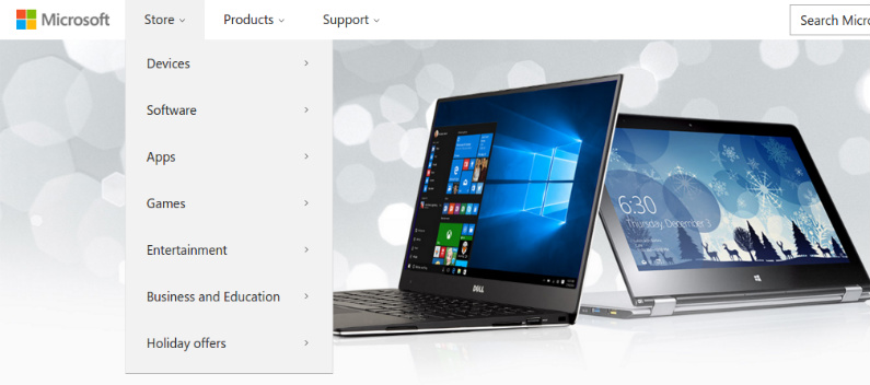
Plan A Structure And Stick To It
This is really something that needs to be done before the main design process of your website takes place so spend a LOT of time making sure the structure of your site is perfect, especially if its ecommerce. Start with the main top level categories and then work down into subcategories and so on but ONLY create a category if its really needed. Don’t create thing for the sake of it. A big mistake in the ecommerce world is to create a new category where a filter may do the job better so think long and hard about the structure of your new site, make it simple and easy to navigate. Once you’ve made these decisions then stick to it. Changing the structure of your site may change the URL’s so be really careful when you do this as it could seriously impact your search rankings. If you really need to change things around then get a web developer to sort things out, research and implement 301 redirects.Use Mega Menus
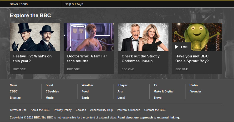
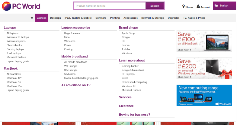
It’s not a new Transformer, it’s a great expandable menu that’s screams usability and really helps your clients discover new content. It also stops your drop down menu items disappearing off the screen if they are too long. I’ve recently spotted a few websites where the drop down menu is so long I can’t click on the links at the bottom. A Mega Menu is a HUGE drop down menu that can hold images and nicely displayed segmented menu sections. This type of menu is really popular with ecommerce stores who have a lot of categories and pages.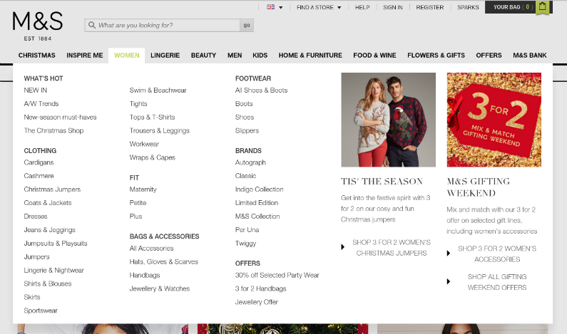
Footer Navigation
Give some love to the bottom of your website. The footer is where we throw all our crap! From terms and conditions to privacy policies and other snooze inducing texts, they all appear at the bottom, and so they should, but add more than just this rubbish. Pick your most popular categories and create a short menu that looks attractive. It will help to generate more page views. You could even have a small section devoted to a couple of best selling items or themes and create a mini-menu for these items. The footer of your website is still your website so make the most of it and create some interesting and attractive navigation blocks.