
One Design To Rule Them All
There are two ways to create a mobile website. One is to have a separate theme designed that will hold all your content, the other is to make your website Responsive. Both work really well but the first way is a little more high maintenance. Creating a responsive site is by far the most popular way to make your site mobile friendly. Responsive means that you have one design to rule them all. Things will look great on your PC browser and when the same content is viewed on smaller screens it automatically changes layout to fit comfortably on the device. This website you’re on right now is responsive and you can see from the images below how the desktop version (top) converts itself into a mobile version (bottom) without having a separate theme or design.

If you’re website is not mobile friendly then have a chat with your web developers about a redesign. It’s also a good excuse to freshen things up.
Create Navigation That’s Easy To Use
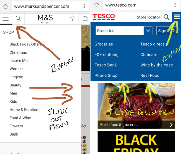
Making sure your visitors can find their way around your website is a huge thing to get right. Elements like images and calls to action must all be clickable and the main navigation should be really easy to use. The little burger symbol has become synonymous with mobile friendly websites offering all sorts of navigation delights when thumbed on. There are slide in menus, ‘drop down from the top’ menus and various pop up menus. One thing they all have in common is that they are activated by the little burger menu symbol.
Keep your mobile navigation quick, simple and the font size big enough for stubby thumbs and don’t forget about making sure all your calls to action text or images are clickable too.
Use Images That Scale Well
If you’re responsive website is designed correctly then all your images should shrink in size automatically when viewed on smaller screens but make sure any text or feature points can still be seen. If you use images with text for offers or big sliders for focal points then take a look at them on a phone to make sure you can still read the text. The last thing you want is for the price or main call to action to be shrunk so small you can’t make it out. When you create your images, think mobile first. This may mean that the left and right of an image on the desktop is blank or textured. Here’s a couple of examples from Amazon. Notice the text and content is towards the centre and the sides and plain. These images scale really well on all screen sizes.

Make Thumbs Fit Forms & Use Autofill
This is a huge point that can really make the user experience either good or bad! Don’t use thin form fields. Make sure your contact/lead/enquiry form is big enough for a thumb to fit in it on mobile devices so it’s easy to use. Also make sure you use as few fields as possible. Test your submit button out. Is it too close to the reset button? When thumbed on does it say something like “Processing…” or change colour so your user knows it’s been clicked? These are all really important questions as forms can be a real bottleneck on any mobile website. Another great technique for mobile forms is to use Autofill which can save your visitor a heap of time. Their browser can remember things like name, address, phone number and email address and if you mark up your forms up correctly the browser can autofill this information making for a great experience. Here’s the code for a email address field. Note the Autocomplete tag that tells the browser to fill things in.<input type=”email” name=”email” id=”frmEmailA” placeholder=”name@example.com” required autocomplete=”email”>
Is The Font Size Easy To Read & Click/Thumb
A well designed responsive website will look after the scaling of fonts so you shouldn’t really have to worry about font size in the main text of your website but make sure any text in images, footers, menus or widgets is easy to read on smaller screens. But it doesn’t just stop at the font size. Make sure the space between lines are big enough to allow for accurate clicks. For example if you have a list of text links or a link appears below another link in the text, make sure they are not squished together too much so that you can easily thumb the correct link. I’ve found myself thumbing the wrong link on some websites as the lines are too close together. Maintaining decent line height will solve this problem.Easy To Use Shopping Cart
If you run an online store then making sure you are mobile friendly is essential. For some sectors over 50% of purchases are now on mobile so providing an excellent user experience is really important. One area to look at is the shopping cart process. As mentioned above, make sure all your form fields are big enough for fingers and thumbs but also look at the ease of use. Make sure product removal buttons on each line of your shopping cart page are easy to thumb and not too close together, the last thing you want is a customer miss-clicking and removing the wrong item. Also provide up/down arrows to increase/decrease quantity boxes. Thumbing a button is easier than having to enter a quantity using a pop up keyboard.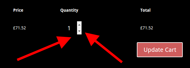
The best tip I can give you is to buy something from yourself and go through the entire process of adding items to the cart, signing up as a customer and proceeding through the payment process. Write down any pain points or niggles and chat with your developers to get them fixed.
Simple Ecommerce Filter System
Another part of the mobile shopping experience that sometimes gets forgotten is the filter section. Having easy, thumbable filters will help your shoppers find products quickly and easily. Slide out or pop up filters with big tick boxes work really well but make sure you don’t use too many and they are actually useful. Hardly anyone wants to filter by A – Z and Z – A! Here’s a couple of examples of really good looking mobile shopping filters.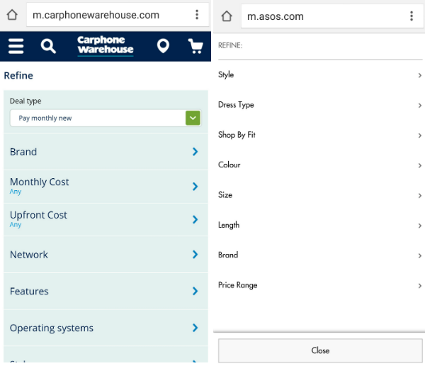
Include Clickable Phone Number & Email Addresses
Make it easy for people to contact you by providing clickable phone numbers and email addresses. The clickable email address is a given and you may have this implemented on your website already by including mailto: at the beginning of your link.<a href=”mailto:youremailaddress”>your email address<a/>
But did you know you can make your phone number clickable so that mobile users can phone you with one click? Just add the following code to your website.<a href=”tel:yourphonenumber”>your phone number</a>
Is There A Home Button?
Having a way back home is important, don’t let your customer get lost. A lot of users like to navigate back to see your latest offers and deals and it gives them a sense of being able to start fresh searches or find links to information they need. You don’t always have to use a Home link but it’s essential that your logo links back to your home page. I don’t have Home links as I try to save to space in my navigation but my logo clicks to the home page.How Easy Is Search
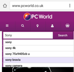
Simple to find and use search is really important on mobile devices. A lot of us have already done the research before we buy something so tapping a name into a search box is all we need to do and we want the correct results quickly. Make sure your search box is big enough. Thumbs and fingers have to tap inside so keep it big enough for stubby fingers. Also make sure it’s really easy to find. Use the spy-glass icon or just have a nice full width search box at the top of every page. Another great mobile friendly feature is using auto-complete. As the searcher enters text a few suggestions appear underneath as they are typing. Remember not to include too many suggestions as a lot of the screen will be taken up by the keyboard so 3 or 4 should be enough. Auto-complete makes it even easier for the mobile searcher as they only have to enter a few characters to find what they want then click the option below the search box. Here’s an example of auto-complete search.